


Years ago in a cab, I learned that the driver was Egyptian by means the new etiquette deems rude. Seizing the opportunity of his divulged origins, I mentioned my fondness for the songs of Ehab Tawfik and especially of Sherine, the hypnotic Egyptian pop star. “The one the little girls are crazy about,” remarked the driver. Seeing me redden in his rear-view mirror, he grinned and returned his eyes to the road saying: “Don’t worry, I like her too.”
I don’t know why Renée Van Halm’s recent show at Equinox made me recall this anecdote about gendered music. It’s unfathomable because, to my mind, her work doesn’t espouse an overtly feminine or feminist theme, so why did gender come up? In fact, her long interest in the aspirations of modernist design and architecture as an improved context for daily life, and the hermetic irony with which she plays with its rectilinearity and palette, feels unisex to me, pardon the anachronism. Maybe it was the source material for her new work, late 19th century ‘French ribbons’ that were factory made by women to adorn a female clientele. Titling it IRL, internet-speak for “in real life,” endows a show of abstract paintings based on old ribbons with a matryoshka doll sequence of connotations from which my lazy brain wants to retreat.
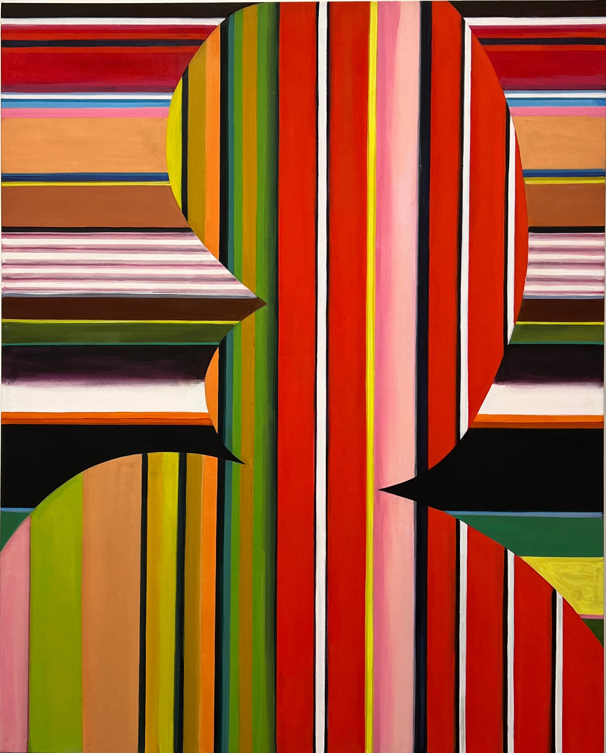
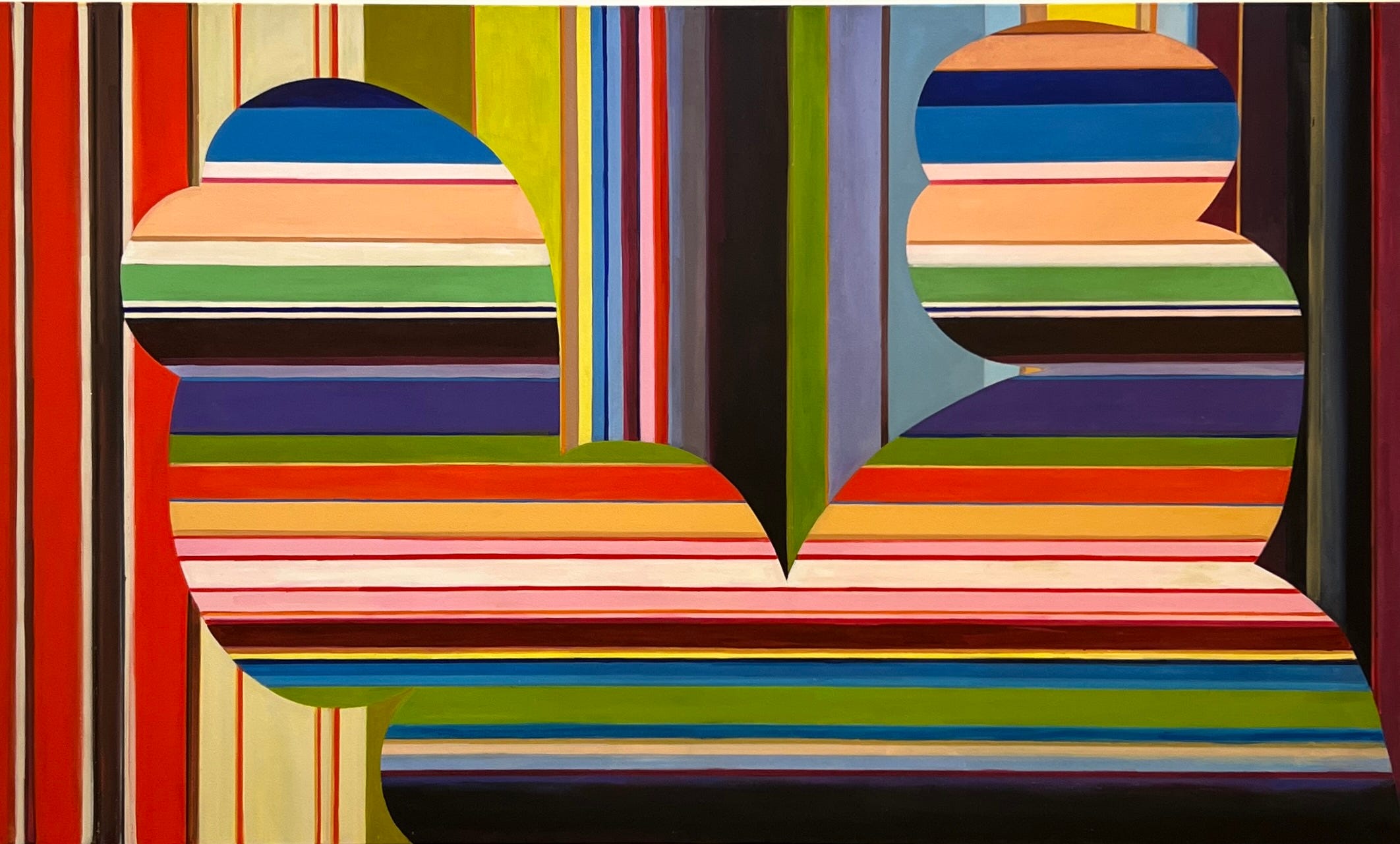
Van Halm’s point of departure, as well as her title, have been encrypted in the pictures themselves, painted in an abstract idiom where stripes are common. You have to be told that the artist was thinking of old ribbons. Even then, the information doesn’t illuminate a point to these inscrutable canvases. The datum feels by-the-way more than salient. But you can’t un-see it, so it must be reckoned with.
Unless feminism is even more comprehensive than I thought, the postmodernist representation of modernism that this artist has long practiced never struck me as a gendered project, let alone one imbued with ethnic sentiment. And yet, if we think that modernism in the visual arts was just another style, we have also to admit that, conventionally, styles are declined by ethnicity and by gender. This last having persisted beyond memory, overcoming the heritage of gender distinctions seems still far off, if not futile, and beset by hostilities. “Vive la différence” remains a nearly universal motto in the binary hegemony native to all shores. For the record, though, difference need not imply hierarchy between the sexes, let alone the ethnicities, which may account for its resilience in the egalitarian West.
Holland is one of the paradigmatic hubs of early modernist architecture, design, and art, a role it continues to play. Moreover, the Dutch are famous for having invented the very soil of their homeland, giving their approach to cultural renovation special status in my mind. Born in the Netherlands, Van Halm grew up in Canada, a multi-ethnic country with a fairly laissez-faire attitude toward the assimilation of immigrants. In Northern Ontario, for instance, where I was raised, many of my friends’ parents spoke precious little English, let alone French (the country’s other official language), despite having lived there for a decade or two. They relied on their kids to interpret the natives.
If it is possible to grow up Dutch in the English part of Canada, just as I grew up French there, Van Halm hasn’t taken the specific de Stijl sensibility as her subject. And yet, hailing myself from the same “New World” country where assimilation is optional, or at least postponed a generation or ten, I can’t help but detect an occult de Stijl frame of reference when Van Halm looks at modernism. I’m a bit ashamed of this, as if I were imposing the ethnicity of her parentage upon the artist’s expression, preventing her from speaking with the cosmopolitan objectivity she might well intend. Such are the wages of diversity where “vive la différence” has broader implications. And I’m also embarrassed that the casual, hand-forward tone of her craft gives it a somewhat masculine finish to my eyes, one that reminds me of boys I knew growing up who drew cars and action figures with care but not fastidiously. Casual, unfussy workmanship reads male to me which, needless to say, is unjustifiable irl.
This back-of-the-mind othering and misgendering notwithstanding, Van Halm’s casual finish distances her from my Dutch hero Piet Mondrian whose paintings Barnett Newman likened to a “well-made bed.” Compared to Mondrian, a paragon of meticulous painting, Van Halm’s easy-going, freehand hard edge keeps a postmodern distance from her subject—idealist, machine-inflected modernism—which she evokes without emulation. Although it took me decades, I’ve come to enjoy this stylistic quirk as an almost moral position, a Brechtian alienating device that establishes the artist’s critical distance vis-à-vis her subject. Like the Canadian artist collective General Idea, though, whose satire of mass media and capitalist glamour can be mistaken for an instance of its subject, Van Halm’s position is ambiguous. Is this a critique, nostalgia or neutral reportage? But then what is “real life,” or truth, let alone an artist’s intention in the withdrawn, cognitive mists of abstract art?
Gender cultures, or traffic between them, is not an explicit theme in Van Halm’s work, but I can’t help thinking about it because of the ribbons. Textiles have preoccupied her in recent years, notably those emerging from the Bauhaus. The wildly influential, progressive, but still sexist German arts academy produced some of the medium’s paradigmatic artists, overwhelmingly women in keeping with the archaic gender divisions of craft that founder Walter Gropius chose not to modernise. These include artists such as Anni Albers and especially the more adventurous but lesser known Gunta Stölzl, whose splendid textiles Van Halm has quoted in recent paintings. For me, it’s the knowledge of her source material that genders her work, rather than anything native to her hand, her line, or her sensibility.
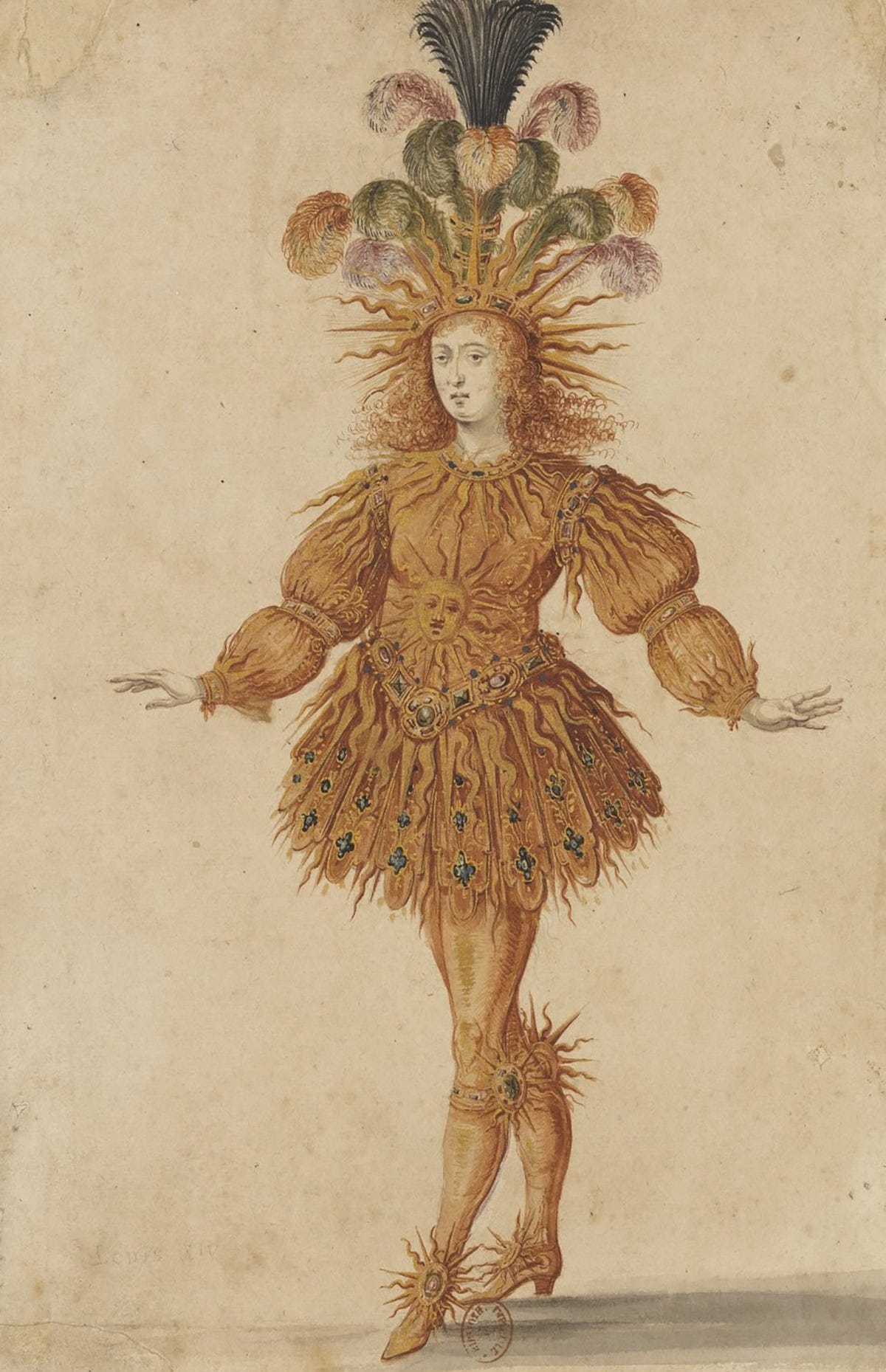
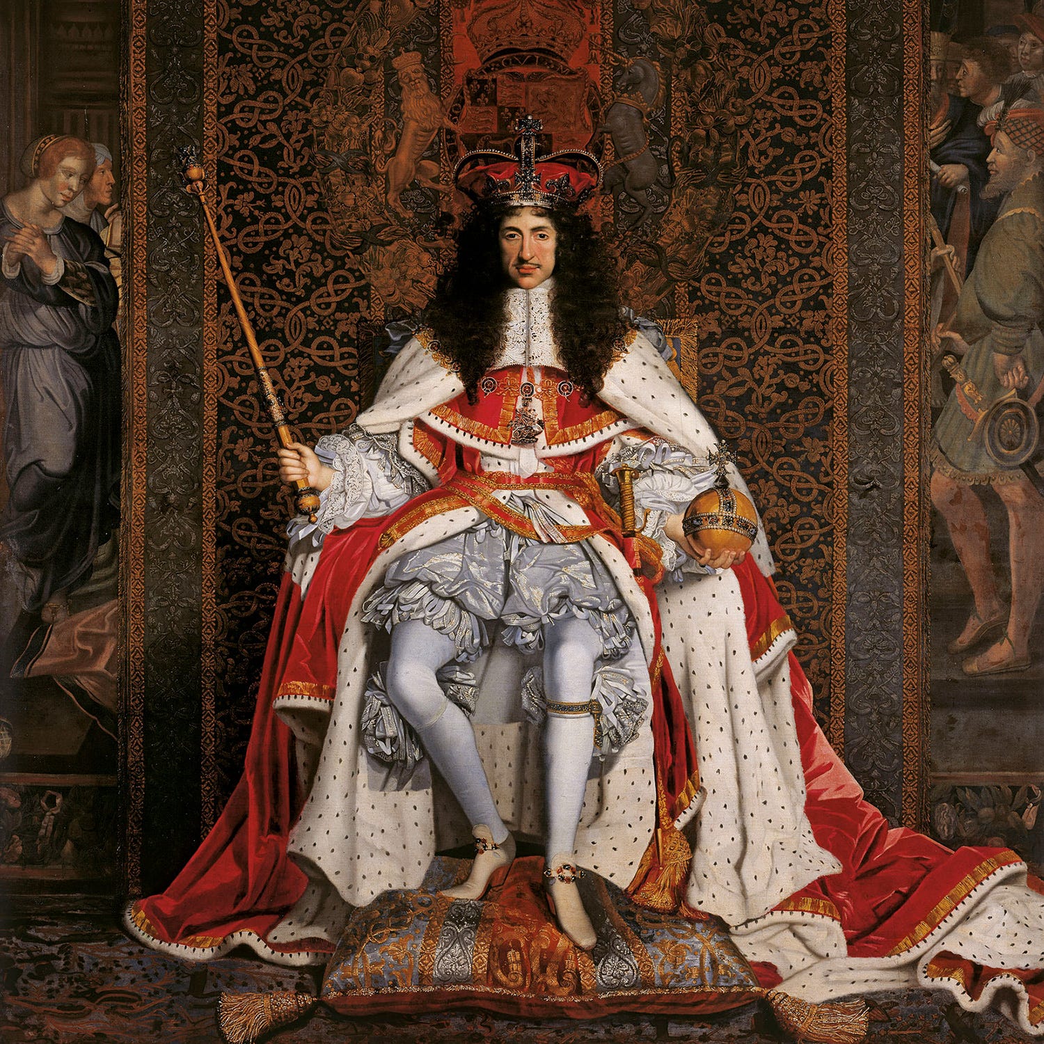
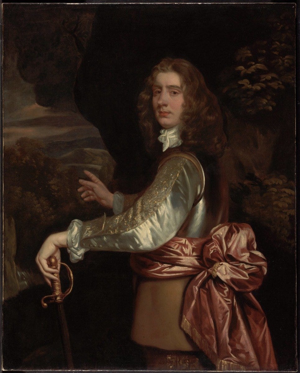
Ribbons are a gendered textile in the common culture now, although it wasn’t ever thus. Military decorations, neckties and straps are the last relics of the ribbon in masculine aesthetics where they once had far more prominence. The ballet dancing warrior king Louis XIV is depicted beribboned in performance. His British counterpart, the hetero-priapic Charles II, also liked his ribbons plentiful. And there’s that mid-17th century portrait by Sir Peter Lely of an officer sporting a broad pink sash, a mega ribbon with a giant bow knotted behind. As big as a bustle, it’s hard today to imagine a time when such an accessory would have been considered masculine, one that denoted swagger and military status rather than camp effeminacy. Modernism has purged the Cock of the Walk of his former flamboyance, reducing dressed-up machismo to the achromatic tuxedo.
Van Halm’s recent pictures make cryptic allusion to Theosophy’s gendered orientation of stripes that reached equilibrium, and by implication parity, in Piet Mondrian’s mature work. For Theosophists, the female principle is represented by the passive, earthbound horizontality of cropland, water, and supine childbirth, while the male is an active, heaven-facing verticality of sun-seeking trees and sundry erections. An early exponent of Theosophy, Mondrian appears more progressive by comparison to formalism’s reductivist endgamers for whom the inclusion of both vertical and horizontal stripes in the same picture became unorthodox. Barnett Newman’s insistent verticals and Agnes Martin’s consistent horizontals can be understood as male and female artists staking their binary, separatist positions. But, in Van Halm’s use of both in her pictures, à la Mondrian, the dated notion is not exposed as utter nonsense, a classic reductio ad absurdum. Instead, I read it as an act of consiliation for the evergreen gender agon. Her return to early modernism’s intersecting stripes seems politically shrewd. Put anthropomorphically, her pictures take “they/them” pronouns.
Before I go on, let me hasten to clarify that these are my own impositions on Van Halm’s work; none of the foregoing was borowed from, or inspired by any artist’s statement or press release that I may have read. This is me, alone, looking. And this viewer’s compulsion to analyse the work of art before him, even if it’s an abstract picture, is hopelessly personal and may well be off. So be it; thoughts are free. Free too is Van Halm’s playfulness with regard to modernist ideals and superstitions. Her respectful transcendence of them has, after decades of indifference, finally made her work compelling to me. In fact, I’m almost as fascinated by my change of heart as I am by the work that I suddently find gorgeous.
Although they strike me as beautiful and strong, the ribbon pictures are not the watershed objects that attracted me to Van Halm’s project. In 2014, I saw a series of small abstract studies—about the size of magazine pages—that got me terribly excited. Obliterating illustrations pulled from décor and fashion magazines with flat, freeform shapes in single colours, she retains just enough information from her source material to conscript the decorated world of appearances for service in the adjacent realm of decorative abstraction. Because this reminded me of synthetic cubism, and because neither Braque nor Picasso ever took the plunge into the roiling waters of the nonreferential, Van Halm’s work from this period takes the plunge for them in a brilliant next move that reclaims the expired paradigm and extends it to infinity.
At the time, I was still imbued with the work of Thomas Nozkowski after organizing his survey a few short years before. He also found an original way to salvage abstraction with small paintings, and restore its relevance for the 21st century. Such aesthetic reclamation has been a passion since I first discovered the work of Blinky Palermo back in my student days. Being hostile to the postmodernist idea of reviving pre-modernist forms, a notion I then took to be a reactionary virus that painting contracted from architecture, Palermo’s dumpster minimalism made him one of my idols, along with his hyper-skillful friend Gerhard Richter, the Alcibiades of contemporary art. With her little pictures, Van Halm evokes the sublime through a procedure that could be replicated indefinitely to turn any random detail of the world into a token of beauty. First seeing them ten years ago, I was flooded with nostalgia for my youthful committment to the continuity of progressive modernism. These small pictures elevated her in my estimation to the status of a comerade in the great cause of modernist renewal and reform. Of course, having only barely met her, I must concede that she may have had nothing of the sort in mind.
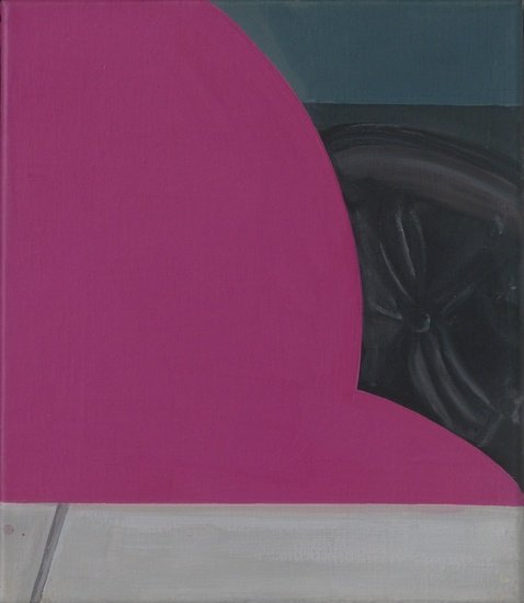
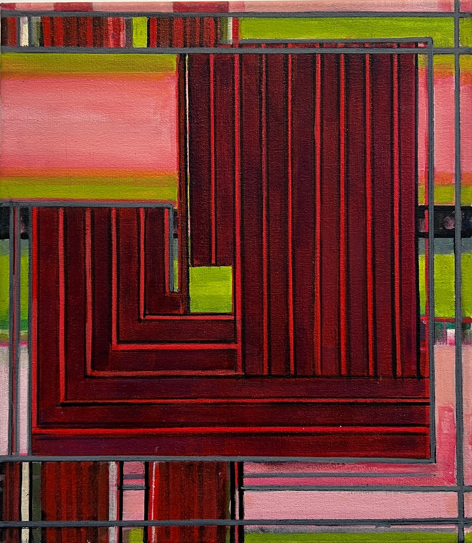
But just how engaged, respectful and consiliatory are Van Halm’s pictures really? While deepening my fondness for her project, her ribbon work does something else, something satirical that still plays with the implication of infinity but as a suggestion local to a finite picture in the manner of de Stijl, rather than implied by the open-ended series of a more conceptual and contemporary nature. The evocation of infinity is an old modernist trope, first introduced by open-ended, life-slicing photography, and eventually standardised for painting by Mondrian, et al. As if returning to pick a fight, Van Halm’s ribbon pictures also juxtapose horizontals and verticals but, with a measure of sarcasm. She negotiates their integration through swelling cut-outs that taunt the formalist dogma of flatness after dismissing Mondrian’s insistence on the primary colours, red, yellow and blue. Using an antiquated palette and a devious line, Van Halm creates the unorthodox illusion of relief and introduces an unwelcome spatial conundrum. Is the curvilinear and horizontal cut-out an object placed against the vertical ground like a seated silhouette? Or do the horizontals form the ground, cut into by the verticals, like a jagged curtain impinging on a stage of matching stripes in complemetary orientation? Which is the ground and which the figure? Technically unresolvable, flatness reigns, but at the cost of a thumbed nose. The roles in her striped figure/ground tango are reversed in at least one of her ribbon riddles, further flouting theosophical principles concerning the orthodox orientation of the genders. Put another way, which one leads and which one dances backwards?
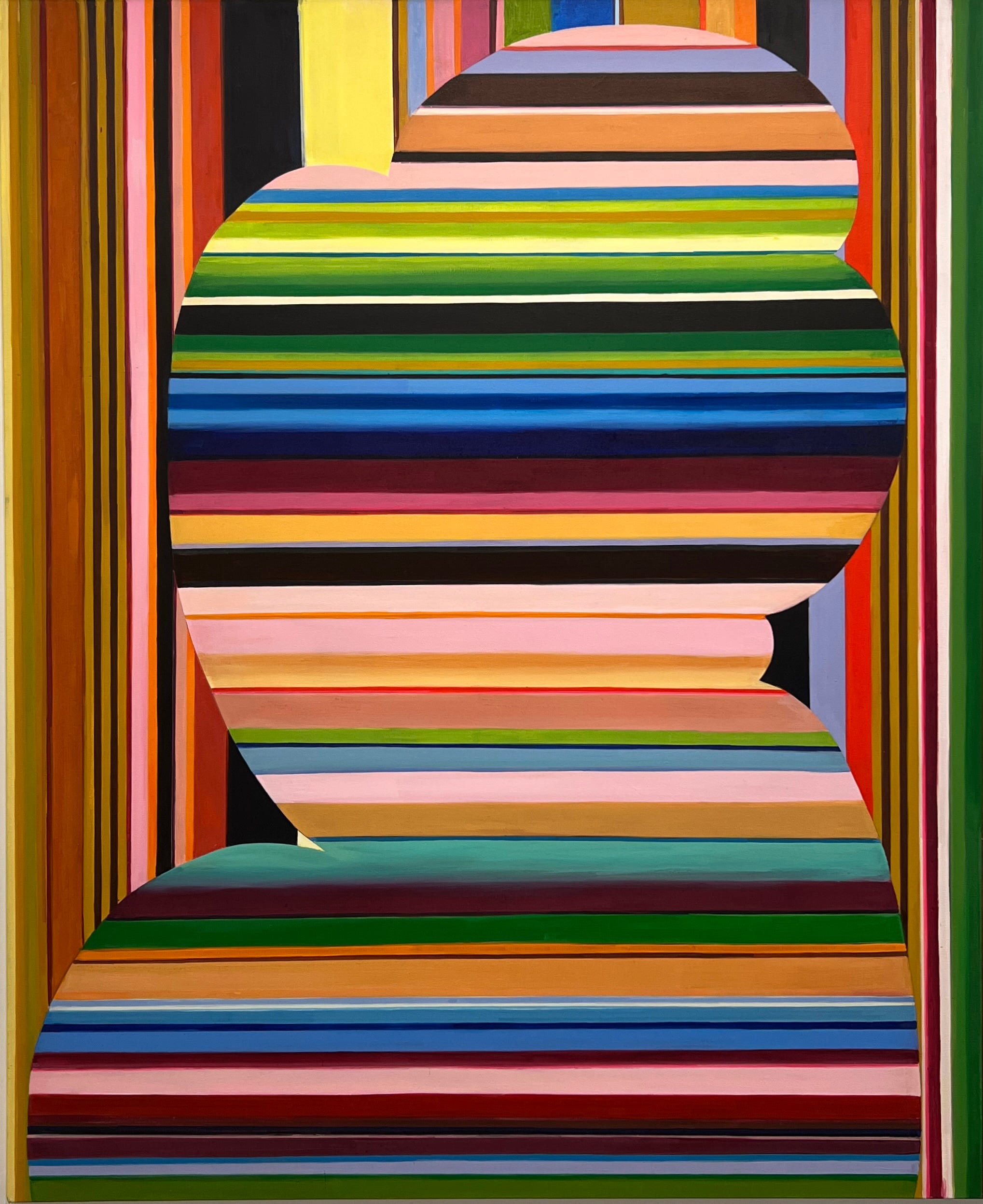
I struggle to identify the distracting ghost forms that contradict the rectilinearity of these pictures. Are the silhouettes echoing the billowing trees in Bonnard’s early murals? Are they quoting Matisse’s increasingly schematized portraits of Jeanette? Are they shadows of figures borrowed from Nadelman, Brancusi, or Lachaise? Or are they quoting Leger’s La fumée? I’m guessing that my masculinity blinds me to the possibility that these may not be figures on grounds, but intersecting grounds that only trace a figure par hasard. But I have no doubt that the biomorphic figure is the point of these treyf geometries. And notice how my references are to male artists depicting feminine subjects.
Van Halm’s voluptuous and polysemic ghost bodies are unambiguously feminine to my eyes. The gendered contrast between horizontals and verticals may well have been dreamed-up by Madame Blavatsky, the mystic theoretician of Theosophy, but the lady was clearly brainwashed by the patriarchy. Is Van Halm saying that the feminine principle has nothing to do with cardinal orientations, but rather that it provides a female context for the interactions of male antagonists, one pushing sideways, the other pulling up and down? I like that but, again, this is almost certainly just me.
Male rectitude and female curvitude form one of my oldest dichotomies, expressed most plainly in a curious anecdote from childhood. Our busy working mother had three children, of which I was the eldest. At breakfast, she used to cut our toast horizontally. In time, my propensity for superstition declared the rounded cut “girl toast,” and the square cut “boy toast.” Being two boys and a girl, we regularly ran out of masculine slices. At my instigation, my little brother and I refused to eat misgendered bread, however hungry we might be. Could she please make more toast? In the name of home economics, and in an attempt to outsmart her sons, my mother began cutting the bread slices vertically, asking us to compromise and eat a bit of both. Unconsoled, this lead my brother and me to eat only quarter slices in stoic resignation until we grew out of the neurosis. I still see my sister’s ironic smile.
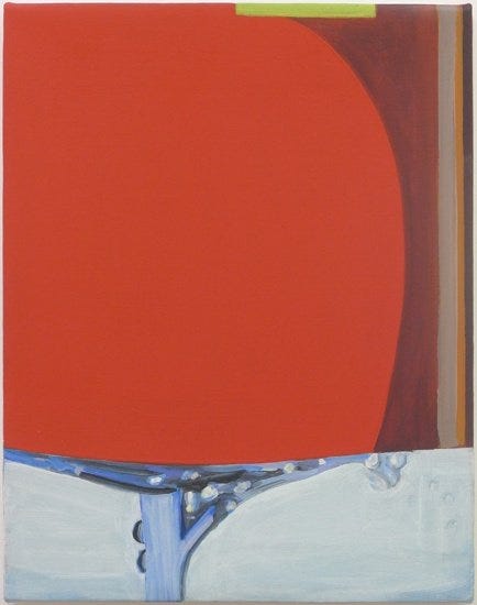
Looking at these pictures with their curvy cut-outs, I cannot help the childish prejudice from resurfacing. Some hard vestige of it must be left in the brain because my favourite painting in the show, also the smallest, has no curves. Painted predominantly in the red of dried meat, it uses both horizontals and verticals to form the rectilinear curl of a flexing arm or schematic fist. The picture’s background of pink and green stripes may well go on to predominate in the wider world beyond the canvas edge, but those ribbons’ job here is to contrast with, and emphasise the primacy of the broad red circuit where vertical stripes outnumber horizontals: boy toast.
Sherine, the pop star, enchants me with her felted filigree voice. I bow to the good taste of the Egyptian girls who made her famous. Like the eratically feminine ghost curves that Van Halm cuts from contrasting lengths of ribbon, Sherine sings the song by resisting the melody, chasing, escaping, and contradicting it while the male musicians sketch-in an anchoring beat. Between her unmoored arabesques and the band’s telegraphed rhythm, you get the impression that you’ve intuited a melody that wasn’t actually performed, that you heard the song despite the singer. Maybe something of that is ultimately why I enjoy Van Halm’s new paintings. Beyond the subject, the references, the research, and beyond the ideas, interpretations and reminiscences that they conjure, in the end, she isn’t painting so much as singing.